

The Brief
Slime Rancher 2 builds on the formula that made the first game a success, offering a rewarding gameplay loop. However, despite a solid concept, several elements negatively impact the overall player experience.
The main issue lies in Slime Rancher 2’s ability to maintain long-term player interest, particularly due to an overly complex interface and an unbalanced progression curve. While the first game captivated players with its simplicity and addictive gameplay, the second installment seems to suffer from a lack of polish in several key areas. To achieve similar success, it is essential to rethink the interface and add more long-term content to keep players engaged.

Slime Rancher 2 introduces the game in a fairly classic way, focused on exploration and freedom. However, it seems to assume that players are already familiar with the core mechanics, which isn’t always the case. A thorough analysis was therefore essential to understand the player’s thoughts and reactions. From the introductory screen that tells the game’s lore to the beginning of exploration, the goal was to carefully examine each element to better identify potential blockers and address them effectively.

In Slime Rancher 2, the reward system is built on a highly satisfying loop. The player collects slimes, feeds them, and then trades the gems received for money by selling the slimes. This mechanic is very engaging and works just as well as in the first game, providing a satisfying sense of progression.
However, while this loop creates strong momentum, questions remain regarding long-term goals and challenges. Even though an overarching goal exists, it is important to integrate smaller tasks or side quests to keep the player engaged. This kind of mechanic is common in MMOs because it effectively sustains motivation.
The game offers a variety of interesting features, such as gadgets to buy and upgrade in the conservatory, as well as new areas to explore. These zones hide bonus chests containing blueprints to build new structures, providing additional motivation for exploration.
Nonetheless, some elements of the game can lead to fatigue after a few hours. While the side quests are interesting, they are not always stimulating enough to maintain long-term motivation. Additionally, the second zone of the game disappointed several players, which may have negatively affected overall engagement. The progression curve also feels unbalanced, alternating between phases of being short on money, underwhelming quests with low rewards, and moments when the player has too much money and ends up with useless gadgets.
What saves the overall experience, however, is the great sense of freedom and autonomy the game offers. Being able to progress at your own pace, explore freely, and do whatever you like significantly contributes to the game’s relaxing and cozy atmosphere one of its strongest aspects.
Before :
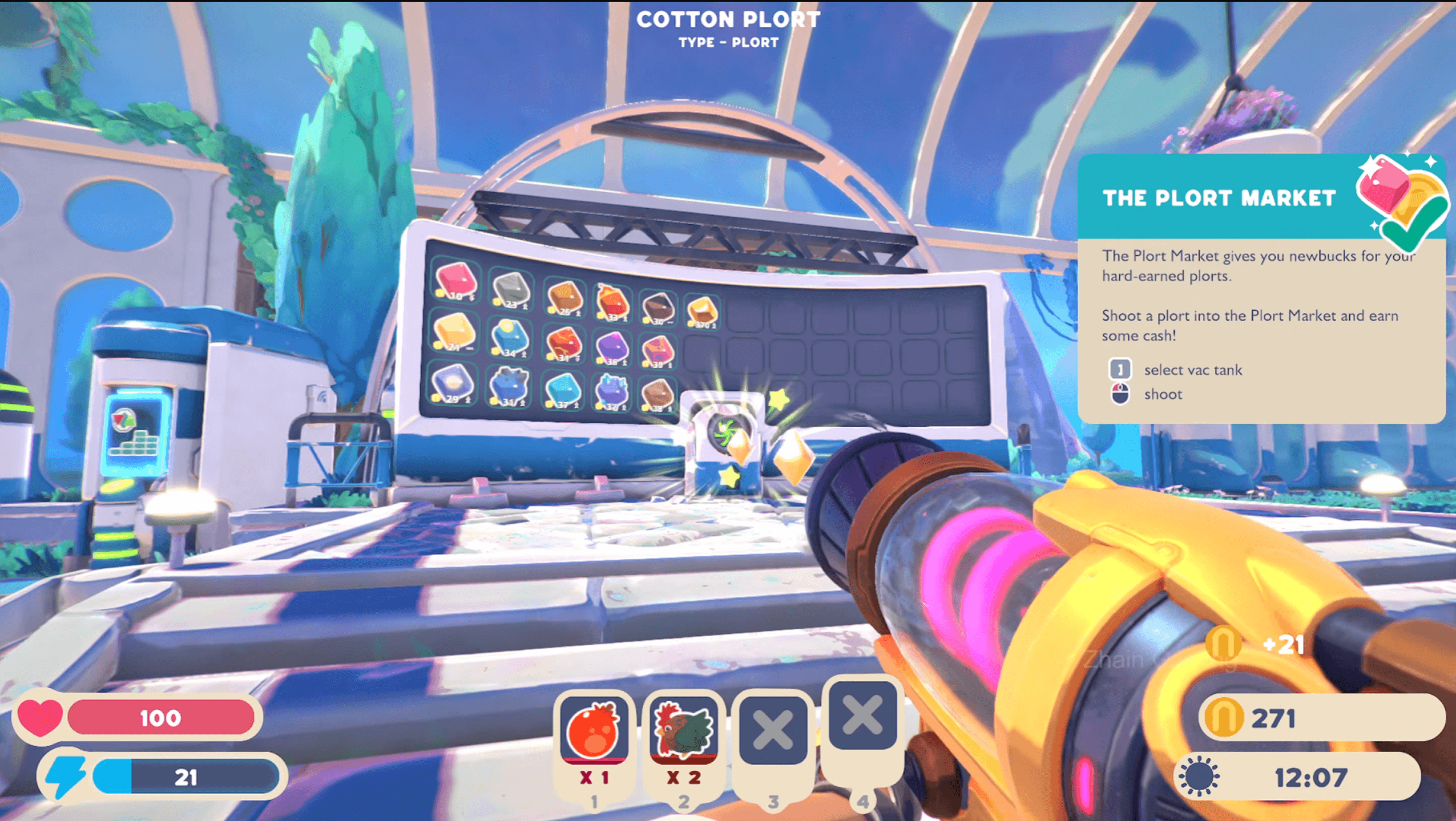
One of the main weaknesses of Slime Rancher 2 is its interface, which lacks hierarchy, is poorly ergonomic, and often feels too bulky.
In terms of hierarchy, the interface has a major flaw: all information is presented equally, without clear visual distinction. Various data are displayed in similar shades of gray, making it hard to highlight essential information, such as health or stamina. It would be more effective to prioritize these elements visually, making the most crucial information stand out to guide the player more intuitively.
Ergonomics is also a weak point. Interface elements are scattered inconsistently. For example, slime food information appears at the top of the screen, the inventory at the bottom, and stamina on the right. This layout takes up a lot of screen space and is sometimes hard to interpret quickly. Time and currency, for instance, would be more logically placed at the top of the screen for easier access.
Finally, the overly large size of the interface is another issue. Stamina, while important, takes up as much visual space as health, which is questionable. While stamina is necessary, it doesn’t need to be as prominent as the life bar. Additionally, the already wide inventory displays redundant information, particularly concerning the cannon, creating unnecessary clutter.
After :
